A harmonious design requires the graceful coexistence of various elements, styles, colors, and empty space. Emptiness helps visually expand an object – giving it volume, depth, lightness, and definition. Many people perceive empty space as a parallel to silence among an abundance of musical notes. It allows you to penetrate deeper into the essence of the imagery. Now, without further ado, we are going to explore how less can be more.

The purpose of space
The structure of mockup design is determined by a large number of graphic elements: images, icons, texts, and background. White space serves to unite these elements into a cohesive whole. Thus, the disparate parts of a graphic structure acquire a solid shell. Emptiness visually helps a text resonate. Newspaper and magazine mockup designers are all too familiar with this technique. A clean white background is also essential for a well-rounded web page design.
Design theory states that white space improves user experience and legibility. Many people disagree with this, insisting that the free space ought to be filled with useful content or advertising instead. But, as practice shows, an abundance of graphics without elements on which the eye can “rest” will have a negative impact on website traffic. Such a resource repells visitors with its redundancy, while white space, on the contrary, adds “air” to a dense graphical interface.
This allows you to:
Create a unified concept for graphic storytelling
Balance fonts, images, and hyperlinks
Improve the experience for users in ingesting your content
Lighten the heaviness of the screen when there is an abundance of technical elements
An overabundance of information visually puts pressure on the user. Empty space, on the contrary, helps give shapes clarity and allows you to relax. If there are particular aspects you need to stand out in a project, whiteness will allow you to do this with ease. A classic example is the famous Japanese ikebana, the harmonious design of which includes the object of observation itself on a white, “silent” background.
White is traditionally considered a symbol of sophistication and elegance. This concept is eloquently reflected in modern design – simple and concise forms on a shiny, white background have long been a sign of good taste among interior specialists, web developers, and graphic designers. The inherent responsibilities of empty space is aesthetically pleasing minimalism as well as the ability to reduce the cognitive load on the users, highlight the focal point, and combine disparate elements.

Types of empty space
Depending on the number of graphic elements in a mockup, there are different levels for categorization – micro space and macro space. By the way, mockups are distributed from a variety of Internet platforms like Images of Yellow, so companies need not create templates themselves.
Micro white space
This separates the main design elements. It is what fills the spaces between paragraphs and lines in the text. It also serves as a divider for menu items and allows you to structure images among those of the same category. In design, micro white space serves to improve readability and make graphic elements easier to perceive. Text is read much faster if it is divided into lines and paragraphs using white space. However, the spacing between lines must be harmonious with the format and font size.
Macro white space
Macro white space surrounds all design elements and fills the gaps between primary graphics. It separates content blocks of different meanings from each other and fills graphic indentations on the right and left of the text. Macro space allows you to visualize a single concept, in a convenient minimalistic form.
The most popular example of such a design is the Google.com website with a laconic logo in front of a clean white background. It allows you to concentrate the user’s attention as much as possible on their main objective – searching for information. Ample negative space is complemented by a small copyright icon at the very bottom of the page.
Active white space
It is used to structure graphic objects on the page as simply as possible. A white background organizes the contents of the field and makes it more convenient for the viewer.
Passive white space
This allows you to aesthetically enhance the perception of an object by arranging content in such a way that it becomes as easy as could be to read. For example, negative space fills paragraphs and lines like this.

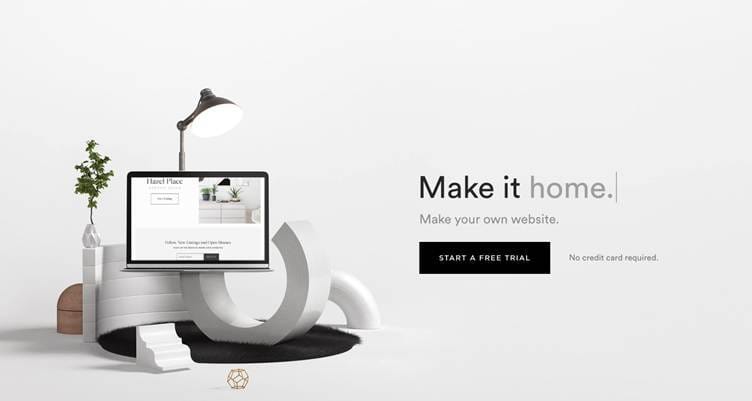
The primary cognitive focus falls on the left side of the mockup, where a stylized logo and an image of an illuminated monitor are seen. To the right you see the slogan, made in classic grayish-black tones. The empty space around it allows you to harmoniously combine both elements, adding lightness, grace, and airiness to the concept.
Negative space in logos
This is free space that separates, surrounds, or connects graphic elements. Designers actively use this technique, if necessary, effectively using space that complements the main content. Posters, illustrations, and logos made via this stylistic technique look attractive and users remember them for a long time. The space that surrounds an object is itself a design component and allows new, unusual shapes to form. Negative space allows you to create logos that draw attention to themselves, highlighting the focal element.

Minimalism
Graphic elements accompanied by a clean white background are often used by premium luxury brands. This allows you to emphasize aesthetics and the absence of visual noise. Many people rightly associate emptiness with order and balance, so such objects are subconsciously perceived as positive. The design turns out easy on the eyes, literally: the total minimalism of the white gives them a rest.
White in web design is often used to create mockups in the spirit of constructive minimalism. It allows the user to concentrate as much as possible on the main thing, avoiding being overencumbered by visual elements. Negative space improves the user experience on the page and renders the design mockup graceful.
Not overwhelming the reader
Reading content becomes much more comfortable when characters are at the correct distance from each other. Professional typographers take empty space into account when choosing:
colors
style
the size
font
Empty space allows you to focus the user’s attention on individual highlighted elements. In branding, this is eloquently reflected in the Apple logo and advertising. Large areas of white space create an atmosphere of conciseness and simplicity. Using their products is a breeze.
Avoid distraction
Negative space allows the user to effectively focus on the main thing, eliminating the abundance of unnecessary graphic elements. Emptiness renders the site lighter, more sophisticated, and more elegant. The absence of competing visual elements allows for a better user experience.
In interior design, white is used to optically expand space, visualize individual important elements, enlarge the structure, and fill the room with light.

Is it true that less is more in design?
The now classic design principle of “less is more” was first used by the architect Ludwig Mies van der Rohe from Germany. Such is the functionality and laconicism of a modern design project. The minimalism trend has dominated for many years. This is why the use of negative space is so popular among domestic designers.
Emptiness injects harmony, renders perception more pointed, allows the user to concentrate on the focal point, and visually lightens an object. Minimalistic website design is initially adaptive, as it will be convenient to view on all devices. The human brain in the modern world is experiencing a global information overload, and emptiness is a trend that is making the perception of objects more effective and simpler. It is not only an effective artistic technique, but also a powerful design tool to render products more approachable, efficient, and attractive.
The post The Impact of Empty Space in Design appeared first on Moss and Fog.