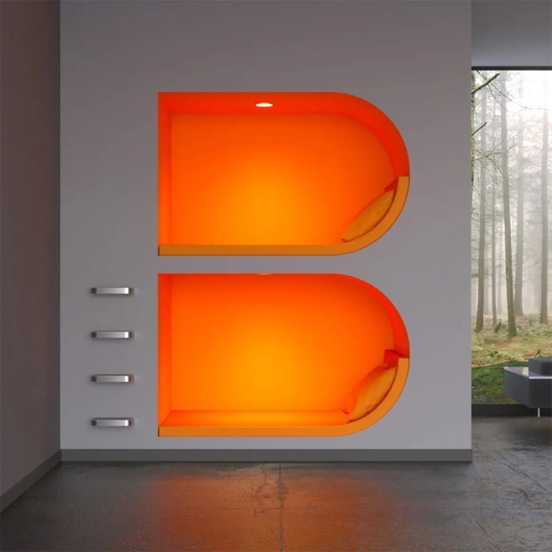
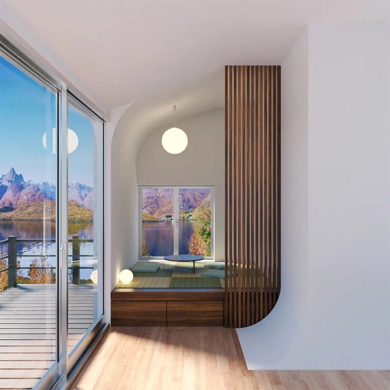
Turkish art director Ilker Kayserilioglu shows us a new take on the alphabet, with a series that puts letters into an architectural perspective.
From structural letterforms to those formed by windows and negative space, it’s a beautifully cohesive series, and feels like a winning formula. Below are just a handful of the alphabet that we found intriguing.
See more of Kayserilioglu‘s work on Instagram.


The post Lovely Architectural Alphabet by Ilker Kayserilioglu appeared first on Moss and Fog.