Do you ever walk into a beautifully tiled bathroom or kitchen and feel an immediate sense of calm, energy, or sophistication? That’s not by accident. The colors around us profoundly affect our mood and perception, and this is especially true in the intimate confines of a small space.
Tile is a perfect medium for harnessing the power of color psychology. It’s durable and offers a vast spectrum of colors and finishes. By choosing your tile colors strategically, you can transform a cramped room into a space that feels larger, brighter, and perfectly attuned to the emotion you want to evoke. Let’s explore how you can use this to your advantage.

The Foundation: Light vs. Dark Tiles
The most fundamental choice in a small space is whether to go light or dark. This decision primarily affects the perceived size and brightness of the room.
Light Colors (Whites, Creams, Soft Pastels)
Psychology: Light colors are open, airy, and reflective. They evoke feelings of cleanliness, simplicity, and serenity.
Effect on space: They reflect natural and artificial light rather than absorb it, which helps to open up the space.
Pro tip: For a truly expansive effect, use large-format light-colored tiles. Fewer grout lines create a more seamless, uninterrupted surface, enhancing the feeling of space.
Dark Colors (Charcoal, Navy, Deep Green)
Psychology: Dark hues feel grounding, sophisticated, and intimate. They can create a sense of drama, luxury, and coziness.
Effect on space: Contrary to popular belief, dark tiles can work in a small space, but the approach is different. They tend to make walls feel closer, which can be used to create a snug, enveloping, and intentionally dramatic atmosphere. To avoid it feeling like a cave, ample, well-planned lighting is non-negotiable.
Pro tip: Balance dark wall tiles with lighter elements on the floor, ceiling, or vanity to keep the room from feeling too heavy.
For a truly transformative effect, consider installing a colorful wall tile as a focal point. A vibrant, saturated backsplash behind a vanity or in a shower niche can inject personality and energy without overwhelming the entire room.

Choosing Colors for the Mood You Want to Create
Once you’ve decided on your light or dark foundation, you can fine-tune the mood with specific colors, a critical phase in any design development. The material you choose, be it ceramic tile, porcelain tile, or natural stone, further enhances this emotional impact.
Blue: The Calm Oasis
Blue is associated with calmness, stability, and peace. It is known to lower heart rates and anxiety. It is ideal for bathrooms and spas, where the goal is relaxation. To create a serene, retreat-like feel, consider soft powder blues in a high-gloss finish for your ceramic tile or the cool, veined patterns of large-format stone slabs.
Green: The Balanced Refresh
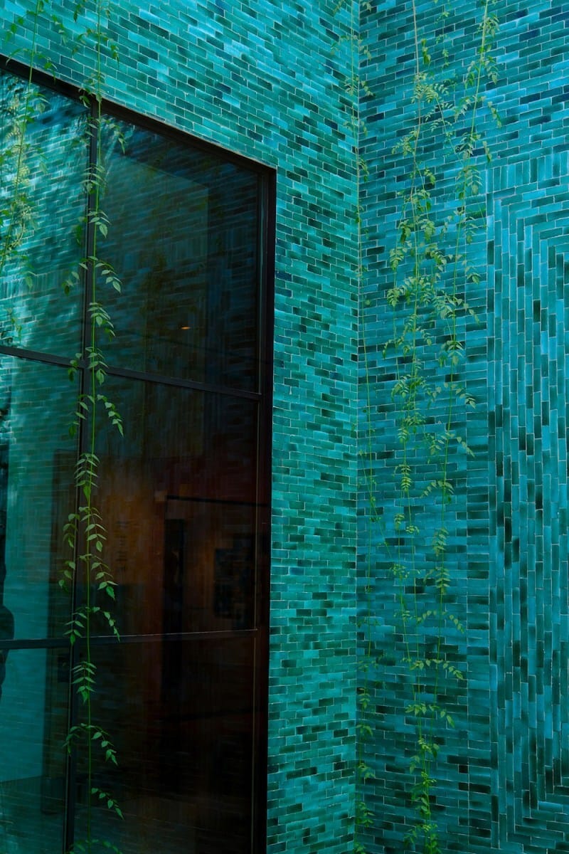
As the color of nature, green is refreshing, balancing, and rejuvenating, symbolizing growth and harmony. It is perfect for any space where you want to feel grounded. A soothing sage green porcelain tile can bring an organic vibe to a bathroom, while a bold, glazed-edge emerald tile introduces a touch of sophisticated ceramic artistry to a kitchen backsplash.

Yellow: The Energy Boost
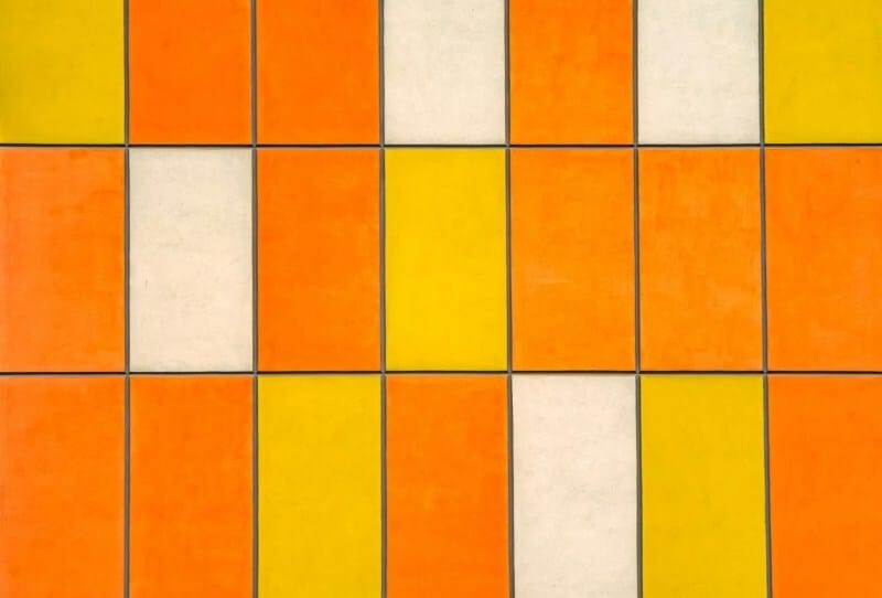
Yellow, the color of sunshine, evokes optimism, happiness, and energetic warmth. It is best used in spaces like powder rooms or kitchens where you want a burst of cheerful energy. To avoid visual overload, use it as an accent; consider a band of mustard yellow ceramic tile within a neutral field or select a vibrant option.
Warm Neutrals: The Earthy Comfort
Colors like beige, terracotta, and warm gray feel warm, welcoming, and deeply earthy, creating a sense of comfort and stability. They’re ideal for creating a cozy, inviting backdrop that won’t date quickly for home design longevity.
Terracotta tiles add Mediterranean warmth, while large-format porcelain tile can mimic the look of concrete floors without the coldness. These hues provide a versatile foundation in interior design, allowing other elements to shine.

Practical Tips for Applying Color Psychology
Understanding color psychology allows you to intentionally craft an environment that feels exactly as you want it to. To help you harness this power in your own home, here are some practical tips for applying color psychology to your tile choices.
1. Accent with boldness
You don’t have to tile an entire wall in a bold color. Use a vibrant tile as a decorative accent strip, in a shower niche, or as a single bold backsplash to draw the eye and add interest without commitment.
2. Consider the finish
A high-gloss tile will reflect more light, making colors feel brighter and the space more open. A matte finish will absorb light, creating a more subdued, modern feel.

3. Don’t forget the grout
Grout color is a powerful tool. Contrasting grout can make a pattern pop and define the space, while grout that matches your tile color creates a seamless, expansive look.
4. Test samples in situ
Always order physical tile samples and look at them in the actual room at different times of day. This is the only way to see how the changing natural and artificial light will truly affect the color and texture.
Bottom Line
Transforming a small space is about perception as much as square footage. By understanding tile color psychology, you can choose hues that reflect your personal style and shape how you feel in your home. So go ahead, choose a color that speaks to you, and watch your small space transform.
The post How To Use Tile Color Psychology in Small Spaces appeared first on Moss and Fog.