Walk into a home where art feels settled, and the rooms feel calm, connected and personal. Frames line up with sightlines, colors echo materials, and nothing fights for attention or space. That balance rarely happens by accident, yet it is not difficult once you follow a few habits. Here is a friendly guide for making art and architecture speak the same language at home.
If you are designing from scratch with Dare Home Builders, early choices about walls, light and storage matter. And if you already live in your home, small moves still align art with daily life. Either way, a few clear steps help art feel integrated without expensive remodels or hard rules. The ideas below sit well with contemporary builds, heritage houses, and every budget in between.

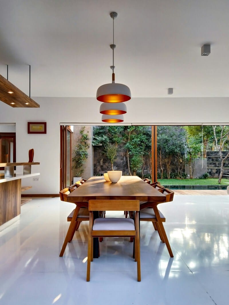
Photo by Rachel Claire
Start With Light and Sightlines
Art can look different through the day, because daylight shifts and light strength changes with seasons. It helps to note where strong sun lines fall in each room, then mark relaxed pockets. Sightlines from entries and seating tend to become the natural places for medium pieces at home. Large works prefer a wall with space around the edges, and less glare from windows.
If the room relies on artificial light, warm lamps soften skin tones and flatter most pigments and finishes. Australia’s Your Home lighting guide explains colour temperature and colour rendering, which influence how reds, blues and whites appear. For living areas, many households like warm white between twenty seven hundred and three thousand two hundred Kelvin. You can read the basics there, then match lamps and fittings to your art and room style.
Where glare is stubborn, light fabrics or blinds reduce intensity, while track spots shape accurate pools at night. Dimmers on circuits that wash walls keep light soft, and texture and brushwork come forward gently. Picture lights near the frame width reduce spill, and thoughtful placement keeps glare off reflective glazing. Those details can be wired during a build, or added later with surface kits and care.

Plan Scale, Spacing, and Breathing Room
Scale can be guessed by the wall width and viewing distance, which sets how your eye reads detail. Big walls like big statements, while narrow walls favour pairs, stacks, or a tall, slender piece. A buffer of hand width on every side stops frames feeling squeezed and hard to approach. y matters as well, since tall rooms hold larger canvases without crowding furniture or mouldings.
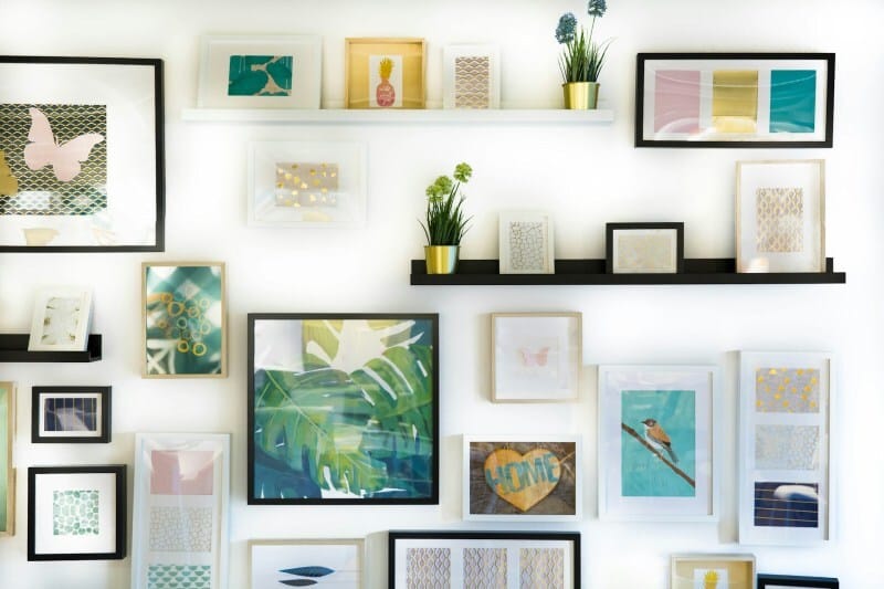
Gallery walls settle best when one clear line holds the group, such as the middle or top edges. A plan sketched on paper with taped shapes on the wall helps balance appear before any nails. If a room feels busy, removing two pieces gives the survivors room and a cleaner floor radius. That small change often brings calm, and the art then carries its weight with less effort.

Color, Material, and Rhythm Across Rooms
One repeated thread, such as timber tone, matte black or aged brass, helps art tie in. When frames vary, consistent mats or a repeated thin profile across sizes sets a quiet rhythm. Rooms also benefit from deliberate colour echoes, so a canvas can speak to cushions, rugs and tiles. That echo reads as intention, not matching sets, and it helps vintage and new pieces sit together.
Builders think about material junctions every day, and those junctions can frame art better than any moulding. A textured render behind a linen canvas adds depth, while smooth plaster suits bright prints and photographs. During a new build, concealed blocking from carpenters allows secure hanging without wall anchors. Integrated picture rails and subtle shelf ledges also work well, and they make seasonal swaps painless and quick.
Consider the journey between rooms as well, since repeating one theme helps the home read cohesively. That theme could be black and white photography, coastal drawings, or bold shapes set against plain walls. By evening, those threads still hold, even as lamps change tone and shadows grow across surfaces. Visitors notice the flow first, and only later realise why the rooms feel calm and considered.

Hang, Lean, and Layer Without Clutter
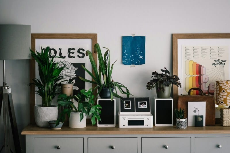
Standard advice places centres near eye level, yet homes vary, and seating changes the ideal height. A corridor reads differently to a lounge, since walking sightlines run higher than seated eye positions. Over consoles, leaving a hand above the surface keeps objects and art in considered conversation. Where walls feel weak, a shallow ledge supports leaning art, preserving flexibility and avoiding extra holes.
As a quick benchmark, many homes like these simple height and spacing rules today too.
Centres around one hundred and forty five centimetres suit corridors, since people view while standing or moving.
Over sofas, aim for fifteen to twenty centimetres above the back, to connect art with the furniture.
Between frames, leave five to eight centimetres, which holds the group together without crowded gaps.

Protect What You Love for the Long Term
Artwork lives better when humidity and heat stay steady, which is kinder to pigments, paper and varnish. Avoid hanging near bathrooms or above heaters, and keep distance from steamy kitchens and hard western sun. Good glazing makes a difference as well, so look for glass with ultraviolet filtering and low glare properties. Simple frame spacers help air circulation, and they stop prints from touching panes under changing moisture.
Australian libraries publish care guides for home collections, and their advice is practical and easy to action. The State Library of New South Wales recommends limiting light exposure and avoiding direct sunlight near valued pieces. Those two habits alone slow fading, and they preserve paper based works that would otherwise age fast.
Where budgets allow, museum grade acrylic weighs less than glass, and it reduces breakage risk near kids. Framers can advise on acid free mats and backing, since cheaper boards off gas and mark works prematurely. A simple inventory kept in a drawer helps with insurance files, should accidents happen after many years. None of this needs to feel precious, because you are just giving good work the environment it deserves.
Bring It Together At Home
Take a slow walk through your rooms this week, and note where art naturally wants to live. Then map the light, test simple heights, and link colours with materials you already have in place. If a new build is on the horizon, plan rails, ledges and blocking while walls remain open. Small, thoughtful changes stack up quickly, and your home soon tells a clearer story through art.
The post How to Incorporate Art into Your Home Design appeared first on Moss and Fog.